Collaborating with a team of editors, photographers and printers, I conceptualize new product ideas, packaging formats, create mockups and product concepts, manage project style guides, and work with editorial to execute design and layout.
I create beautiful, innovative, and cohesive book and book plus products. The scope of my work ranges from complete concepts to single covers, interiors, and packaging.
Over the years, I have also created annual reports, brochures and newsletters for non profits, museums, real estate companies, and financial institutions.
Experimental work with color, fold outs, and pop ups.
outside
clouds lush
pigment deep
swirling, crimson
orange craves blue—
green
gray, yellow
sting like wild wind
authentic and rich
my palette
my century
glow, evolve.
listen.
a lesson in enduring
magenta pauses,
cobalt blinks.
raw and bold.
it’s not a question.
but an art agenda
allow the texture to emerge
a beautiful circle chronicle
a gallery royal
plain paper painted
stars folded
fallen from the sky
into mini-manifestos.
For the past few months I have been creating tunnel book structures and my favorite, accordion painted/collage books and lots of pop-up cards. These are wonderful arenas where I can experiment with new structures and ways of combining type and image.
I find beauty in the imperfect, the ephemeral, the discarded and overlooked. I am always creating. Play is an essential part of my process, whether designing artist books or assemblages. Because so much of my professional work is done digitally, my more creative work provides an arena to play and experiment with letterpress, book structures, paper ephemera, pop ups, paint and random typography.
My newest art book, October 2024 :: Myths & Coronations :: collage carousel/star book with images from painting and art books, and a book on monarchs. Each spread is dimensional with elements cut out from paper, hand drawn black and white frames. When book is closed measures 5.5 x 8.25; ties with ribbon.
In June 2023, I visited the Natural History Museum/San Diego Special Collections Library, with SDBA, and this book, in particular, caught my eye. HORTUS SANITATIS—a book also in the Morgan Library in NYC— is a 16th century tome of botany, medicine and natural history. The woodcut border art, as well as the woodcut illustrations of plants, animals, minerals, and genre scenes inspired me to create a tunnel book from the photos I took of the many pages.
My tunnel book measures approx. 7 inches across x 10.5 inches tall, and when you look inside, you see a showcase of the various, beautiful woodcut illustrations.
The blue tunnel book, Calypso (2024), measures 11 inches wide x 8.5 inches tall and has a hardbound, custom cover. The smaller, purple tunnel book measures 8.5 inches wide x 5.5 inches tall, and has a hardbound, custom cover.
I rarely build tunnel books this elaborate because I find them complicated, but once I begin the process I find my rhythm of cutting (drawing with my X-acto knife), creating the gussets and, of course, adding in all the imagery. I have had these colorful images of fish for a while—now they have a new home in their under-the sea-paper-aquariums.
All of the tunnel pages were all hand cut.
And yes, I will be presenting this as a workshop in 2025, so you can build one, too.
I rediscovered Artists’ Books when I was in grad school and began creating these structures to contain my written and visual ideas. Many of my books are experimental and play with text, folds and bright colors.
Bring the Car, Darling (2024) was just awarded an HONORABLE MENTION in the "Art of the Book and Paper" international exhibit at the Central Library of Rochester. This inventive flag book structure features die cut cars, painted flags and scraps of colored wire embellishments. The show is from August 20 through November 30, 2024 in Rochester, NY.
Red, for me, is a powerful color and this book symbolizes the range of emotions I have felt over the past few years. Using a spectrum of reds and purples, this small board book encapsulates my rage, introspection, confusion and empowerment as I become older and adapt to the changes within my own body and life. All flows together, entangled and complicated, to create a vibrant and personal mosaic. My artist book, Crimson Stories, was featured in the Center for Book Arts show in NYC, Hello Thank You Come In: A 50th Anniversary Members' Exhibition in spring 2024.
The Honor of Motion (2024) was purchased by the Baylor Special Collection Library—this book is an expansive hand-painted accordion with hard covers.
My “exploding book” Medieval Art (2023)— is an “exploding book” created from hours of cutting images from a discarded Art History book. Fascinated by pop ups, I randomly folded pages and created paper platforms to mount the many images I sliced from the interior pages. The images were then assembled onto tabs. The book takes two-dimensional images and transforms them into three-dimensional works of art. Assembled and presented, the art assumes new meaning and provides life to these dusty figures. They are once again on display to be studied and admired. This was juried into the West Coast Fiber and Textile Arts Show in September 2023 at the Escondido Arts Partnership Gallery in Escondido CA.
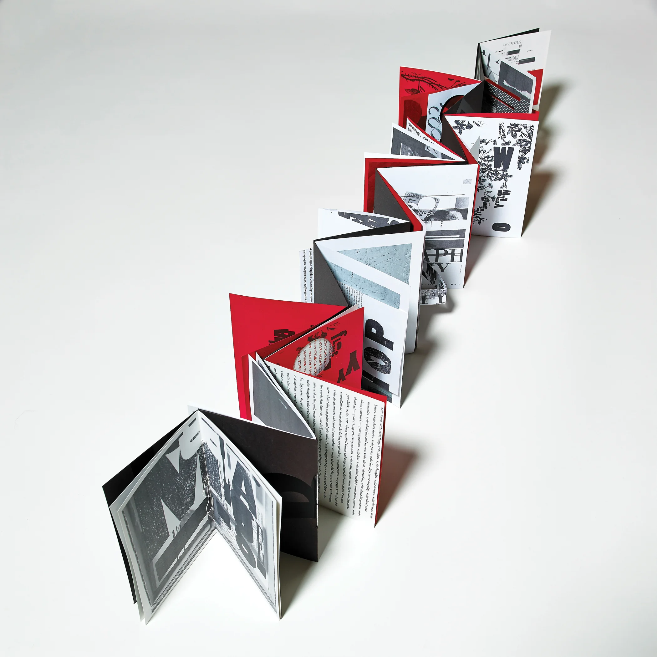
Write Ideas, features discarded prints I pulled from letterpressing in the Fall of 2022. Assembled into a personal, handbound volume, both sides of the book, when opened, reveal color, overprinting and typographic experiments. Inspired by a letterpress poster by Amos Kennedy, “If Bad Printing is Wrong I Don’t Want to be Right,” I decided to embrace imperfection, take the discarded prints from my letterpress experiments and bind them together into an expansive accordion-style book. The structure when opened, unfolds and reveals the color and typography contained within the panels. A small collage begins the book. Covers were painted on paper with acrylic paint, folded over book board, bound with book cloth, then put through my letterpress capturing the remnants of ink and scattered bits of letterforms. The entire book presents my art as ephemeral, illustrating the scattered broken pieces of words and ideas that pass through my days—some treasured, others lost. This book was juried into the “Art of Book and Paper” Fall 2023 exhibit at the Central Library of Rochester in Rochester NY.
A Letter To Absurd Dreams was juried into Paperworks’ exhibition, [ih-maj-in} at the University of Arizona: Poetry Center, in Tucson, Arizona from April 6-June 24, 2022. This book features a hand painted cover with painted pages inspired by a series of dreams I had last fall. The colors, patterns and writing all blend and echo the absurd, vivid dreams I had been having throughout the pandemic. The dreams stayed with me throughout the day and resulted in this single-panel flag book full of bright color where layered shapes tangle with random phrases and words. The book also inspired a short poem.
Wish You Were Here(Summer 2021), is a collaborative book arts project containing postcards from 30 participants in seven book arts organizations across the US. Each postcard was hand crafted and mailed. I compiled my collection of postcards into this creative boxed set.
Pieces of the Sun, a double accordion book, was in the Kalamazoo Book Arts Center’s 12th annual Illustrated Accordion, Online Exhibition, May-June 2020. Media used is acrylic and tempera paint, marker and wax pencil on paper, folded, stitched; ends covers are book board covered in red book cloth. Measures closed: 5.5 inches wide x 11.25 inches high; expanded open measures: 18 inches wide x 11 inches high, 2020.
Dialogue is Exposed, an accordion book structure I created during my second semester in grad school was featured in Abecedarian’s August 24 - September 28, 2018 exhibition (Artist Book Cornucopia IX). This book was purchased by Baylor University, Special Collections Library.
Inspired by the 1957 poem, A Ball Is For Throwing by Adrienne Rich, I created a flag book that celebrates freedom and life. With a bold color palette and die cut orbs, the playful design encourages the viewer to engage and experience visual joy within the multiple panels, reinforcing the meaning of the poem. This book was part of the San Diego Book Arts Louder Than Words exhibition at the Frances Parker School in January 2020.
A Spider Sewed at Night was featured in Biblio Spectaculum (June-August 2020), a national juried book arts exhibition of artist books and text-based visual works. This book was also juried into All Stitched Up, a Puget Sound Book Arts exhibition in 2019 at the University of Puget Sound. This book was one of fifty books selected from 198 submissions. My accordion folded book showcases my writing and collages inspired by the poetry of Emily Dickinson and is a complement to my MFA in Graphic Design thesis.
Mother: Accordion book structure with pop outs and pamphlet-sewn pages, with family photos featuring three generations of mothers— my mother, my grandmother and great-grandmother. The muted colors and multiple layering of text images mirrors the complexity of these relationships within my family and illustrates a very personal story. Also tucked inside is the 1951 poem, The Mother, by Ruth Stone. This book was juried into the Philadelphia Center for the Book’s Variations of the Artists Book exhibition at City Hall (August-December 2019).
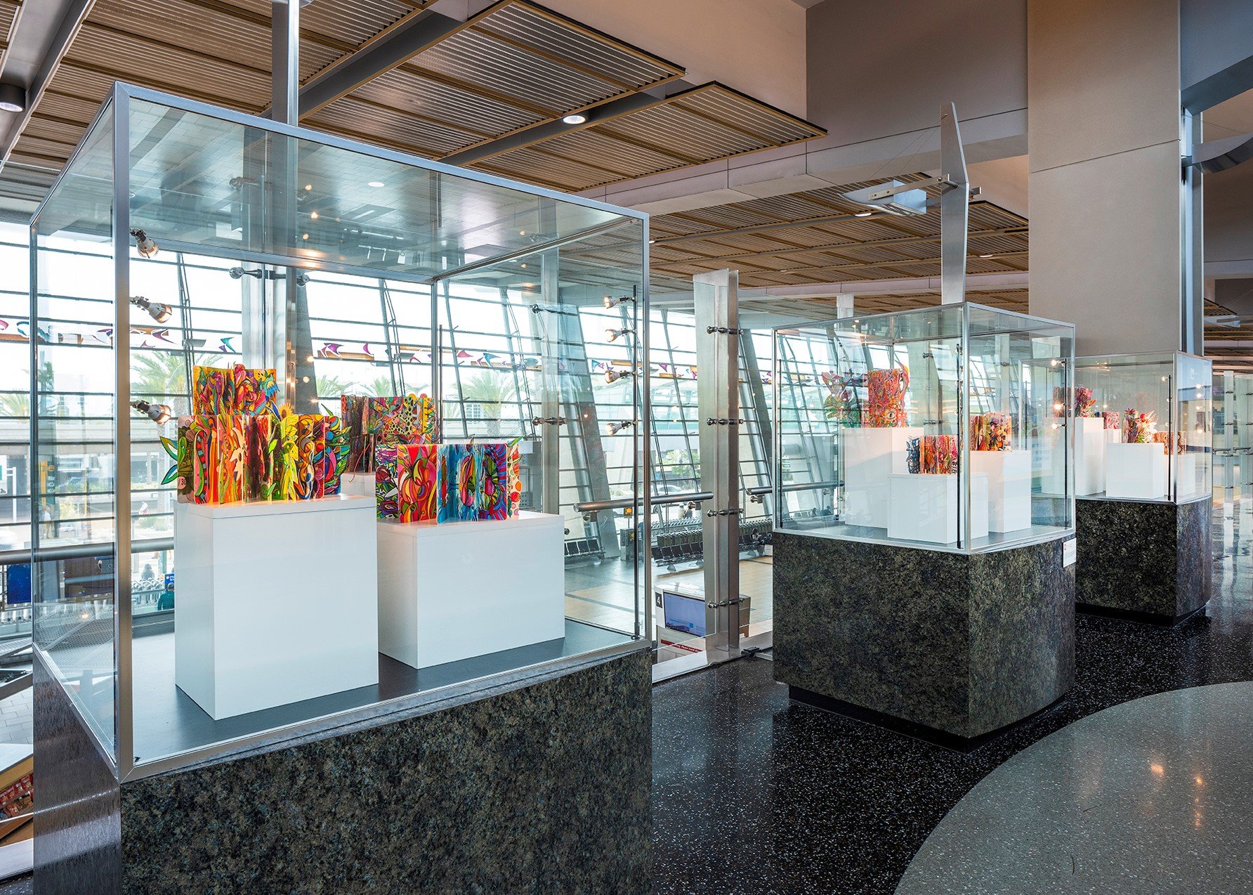
I was honored to be one of fifteen artists, selected from 100 entries, to display my art at the San Diego International Airport. In the summer of 2022, I responded to a call for local artists to submit a proposal for a temporary exhibit, entitled “A Necessary Departure.” The goal of the show, stated the press release, was to “create a conversation that acknowledges the worldwide pandemic as a societal anomaly, while also highlighting the resulting ways that artists and creative thinkers have contributed to positive change.”
During the pandemic I created a series of eleven books, made from discarded board books. Within these pages, I traveled to invented, tangled worlds where line, shape, birds, roses, rockets, tigers, bold words, polka dots and starbursts swirl, play and collide. An arena of my skill set I had never fully explored began to fully emerge, and in Fall 2020 I began sharing my work online and entered a gallery show. I realized my drawings were the perfect manifestation of not only what I needed to express, but were resonating with viewers and followers, too. My books became bolder and bigger and I became addicted to this daily ritual of drawing, coloring and shaping these original pages.
My collection, “When Doodles Dare to Dream” was showcased in three illuminated cases in Terminal 2. The books were drawn on recycled book board with sharpies, and colored with pencil, acrylic crayon, paint and marker. They ranged in size from approximately 8 inches wide x 8 inches high to 10 inches wide x 15 inches high. Grouped together, they collectively form a bright, imagined, paginated wonderland for passengers to see as they traveled through the terminal. The exhibit was from December 2022-January 2024. I hope you were able to see this exhibit on a trip to San Diego, but if not, here are some images of my work.
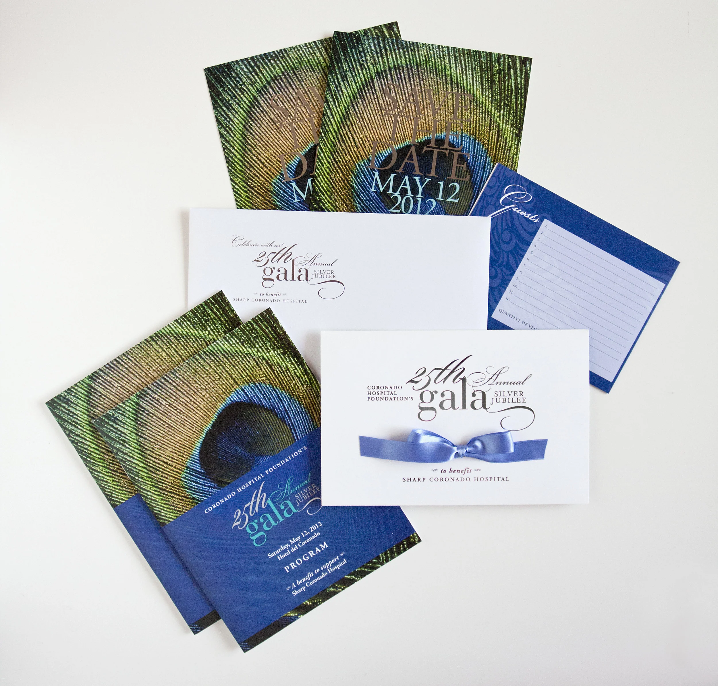
Using bright colors, vivid imagery + thoughtful messaging I craft invitations for organizations and non profits. I often work within small budgets but my goal is always to make a memorable impression on the recipient, sharing the organization’s mission and identity through compelling, custom design and creating excitement for the event.
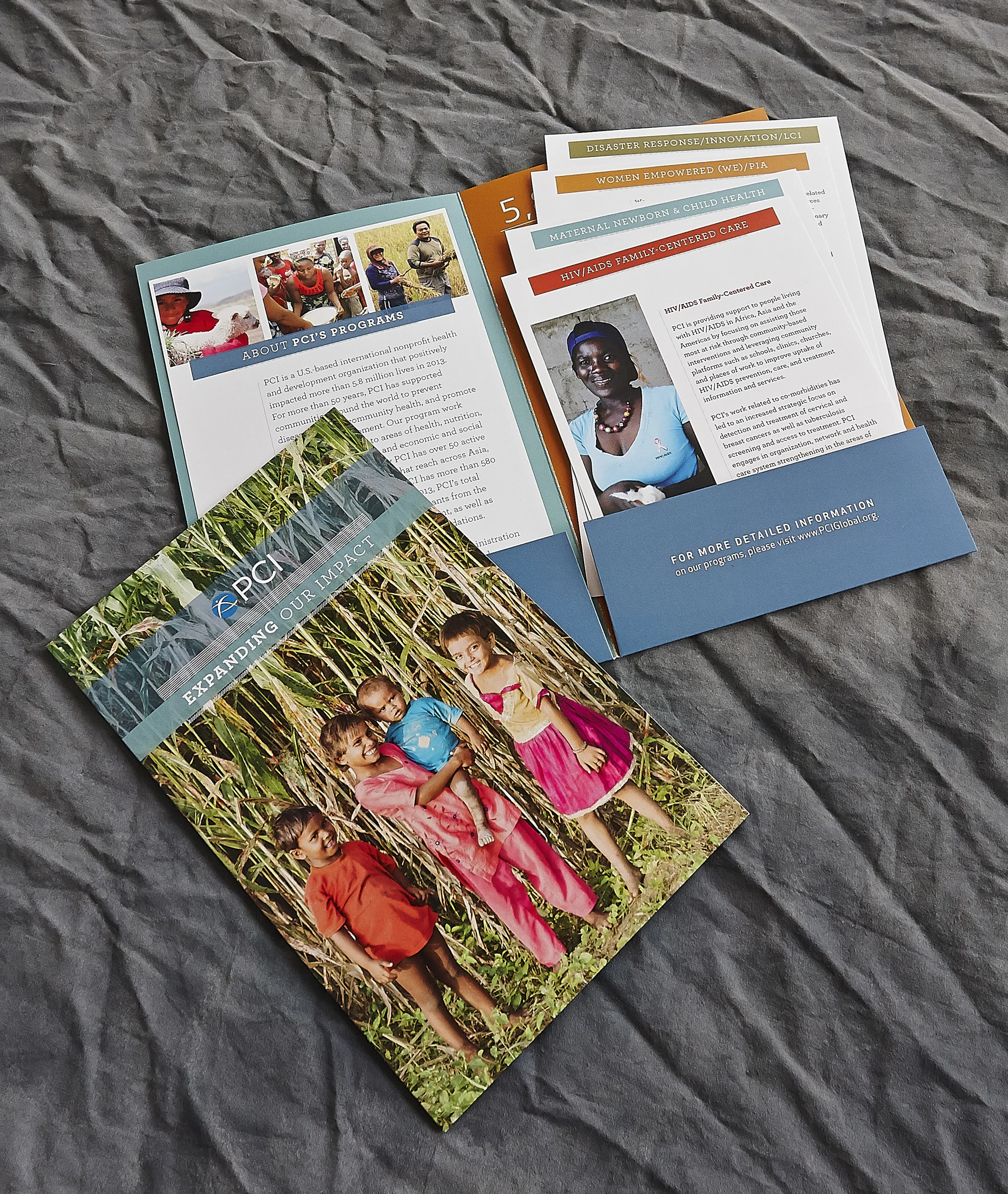
As creative director/graphic designer, I have a deep understanding of storytelling through branding and advertising, designing brochures, direct mail appeals and other collateral. My clients trust me to craft beautiful, highly visual and strategically engaging material that champions their expectations, mission and always comes in on budget!
Presented here are some projects that I have designed for diverse clients — non profits, medical research organizations, local community centers and museums.
We must reconcile ourselves to a season of failures and fragments. — Virginia Woolf
Collage is not an exacting craft, no guides or rules, just paper and my imagination. It is an integral element of my design practice, allowing for thoughtful ideation grounded in a documentation and regeneration of ideas.
My work was featured on the cover and inside the 2020 Winter issue of Kolaj magazine.
“…it’s the thought behind all that scissoring and gluing, the choice and arrangement of elements, the savvy collusions and chance associations, the proverbial whole that becomes more than the sum.”
— from Mark Polizzotti, John Ashberry — They Knew What They Wanted/Poems & Collages, September 2017.
Explore. Play. Learn.
Creating personal work is imperative to me as a graphic designer. Over the past year, I have developed projects that motivate me and keep me inspired. My passion for color, bold typography, packaging and photo styling allow me to constantly experiment, develop + learn new skills.
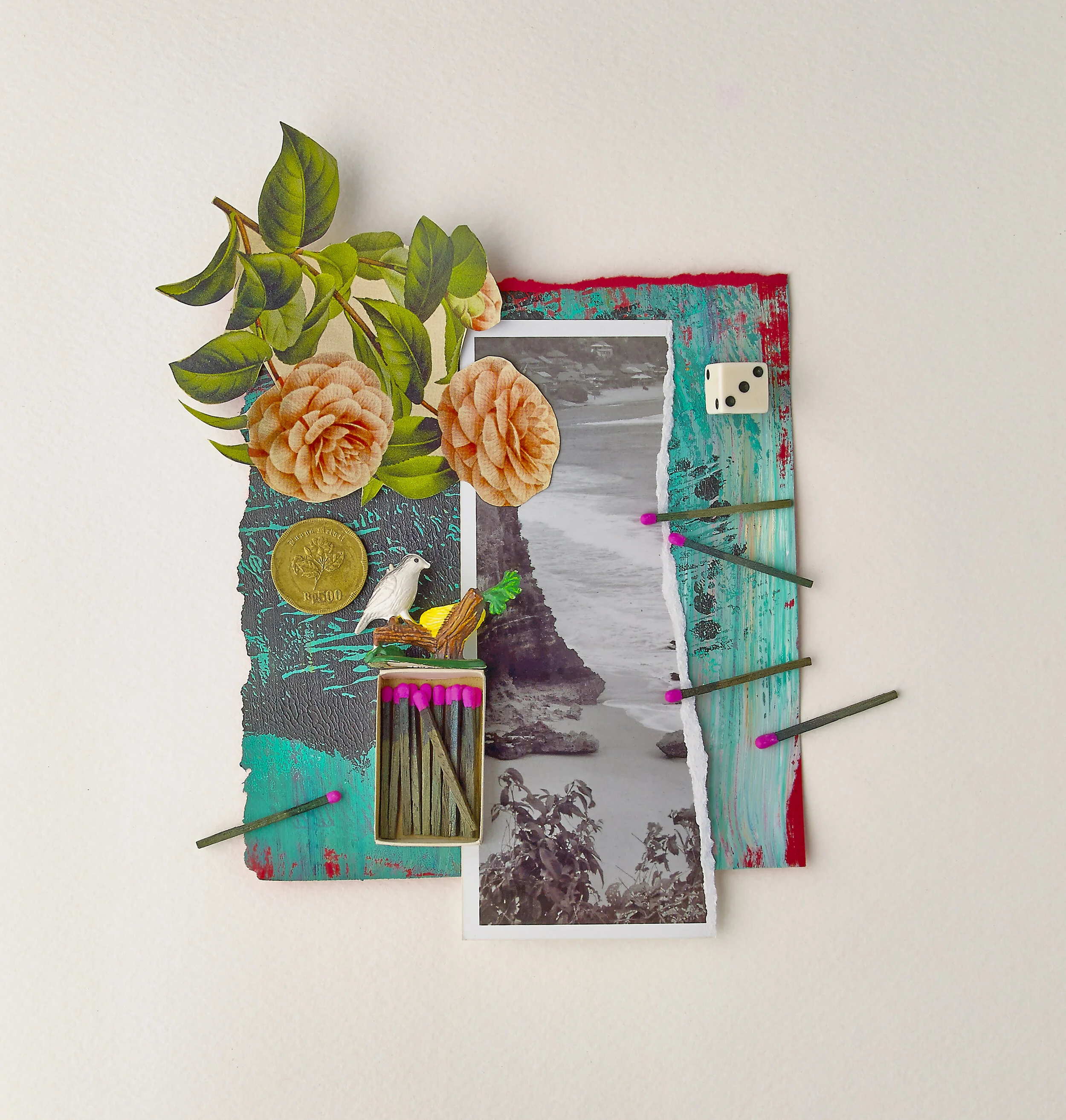
During the past year, I have been creating assemblages, created from all the discards—bits and pieces of things that are found in my garage. There is beauty and magic in discovering how random objects nailed, glued and attached into unusual combinations, make powerful ideas and visuals.
I know nothing that has as much power as a word. Sometimes I write one, and I look at it, until it begins to shine. — Emily Dickinson
Pictured here is my final thesis project, A Lady Red & The Em Dash, which I completed as part of my MFA in Graphic Design. Inspiration for my process began when I was searching for a poem to design and print letterpress in October 2017, and I was reintroduced to the work of Emily Dickinson, the enigmatic nineteenth-century poet. She trusted her words and process, defied societal norms and combined writing and design, adding her hyphens, confident that we would arrive at our own interpretations.
After considerable research and reading I united Dickinson’s words with my interests in feminism, typography, collage, poetry and book making. I created a portfolio of broadsides and large posters, small chapbooks, and designed, of course, a hand-bound thesis where I explored the visual beauty of her words, her mastery of “painting with color” and her Dadaist spirit.